Developer Diary 11
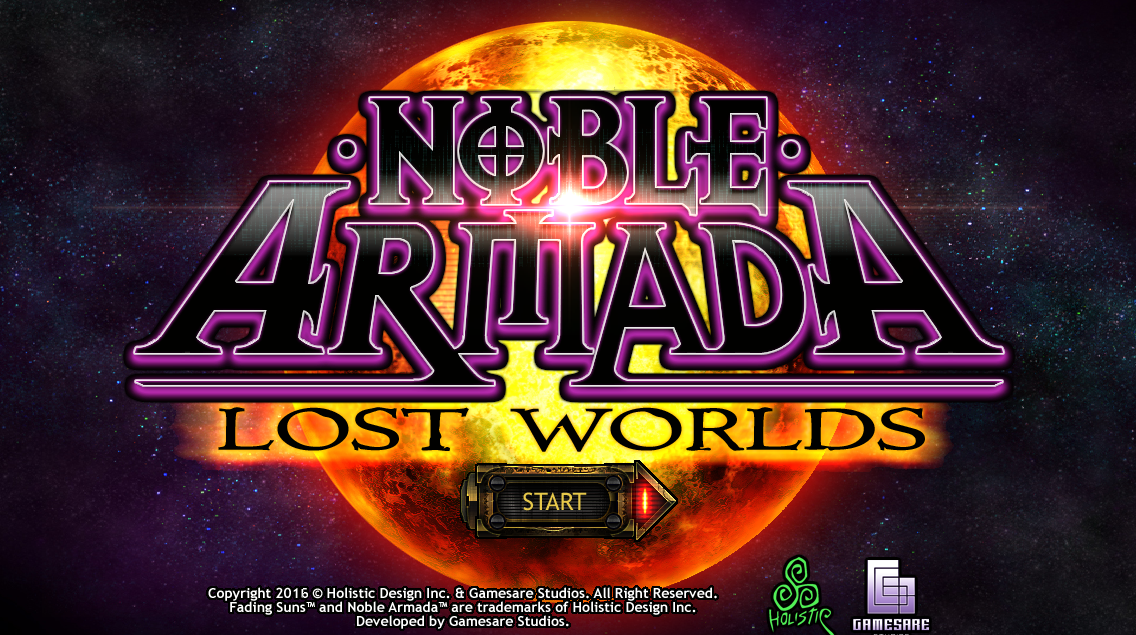
Along with the new game name, we need a new logo for Noble Armada: Lost Worlds. I have two examples here. Do you have a preferences?
- Fiery Background
2. No Background
| The site of game designer Andrew Greenberg. All opinions expressed here are my own and are not reflective of any organization to which I belong. | Friday, 24 July 2026 - 20:41 |
Developer Diary 11
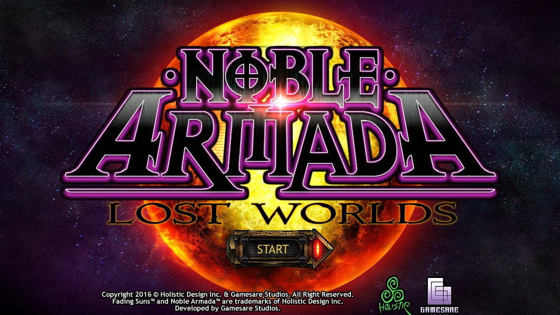
Along with the new game name, we need a new logo for Noble Armada: Lost Worlds. I have two examples here. Do you have a preferences?
2. No Background
You can follow all the replies to this entry through the comments feed
The picture on top seems more eyecatching.
Much appreciated
Top one. The halo allows you to actually read the subtitle.
Even illiterate bums like me!
I am going to say No. 1, the background helps see the “Lost Woulds” better.
“Lost Worlds” NOT Woulds please edit
But I have always been lost in the woulds 🙂
I agree the picture at the top is more impressive.
And talking about pictures/screenshots and so that: what part of the info available in 2011-2015 for the proposed NA game for iOS/Android will be relevant to this NA: Lost Words. thanks
There have been some significant changes to the original mobile plan, giving the PC version more depth of play. We wanted the mobile game to be a very quick space strategy game. Now NALW is a mix of the two, with more for players to do than the mobile game offered but with shorter play experiences than a game like Emperor of the Fading Suns. We still focus on the combat experience, but give the player more options then as well as after the fights.
Thanks. I enjoyed a lot EFS while I never finished a game (turns too long when you advanced ROFL).
I even played old NA beta demo (in 2000 or so that), it wasnice
Great to hear. The new Noble Armada PC game is designed to be a much shorter play experience, but infinitely replayable.
The last two letters in the bottom logo seem lost to me….
Thanks
Logo 1. Fiery Background.
Thanks for the input